The App Router is a major change to Next.js. It introduced a lot of features that help in improving the overall speed of the app and reduce the client-side bundle size. One of the main features that help with this is React Server Components. RSCs are just components that render only on the server and send only the generated HTML to the client. This also means that npm packages used in RSCs are not sent to the browser. This itself can reduce the bundle size a lot. But there are many other things that you do not need to do in RSCs that increase bundle size. Lets start by creating a new Next.js app:
$ pnpm create next-appAvoid Lazy Loading Server Components
Lazy loading can be helpful for splitting a app’s bundle size into very small chunks that can be loaded on demand. However, RSCs do it out-of-the-box. Trying to lazily import a Server Component can actually have negative impact on the bundle size.
import { lazy } from "react";

// Don't
const ServerComponent = lazy(() => import("@/components/ServerComponent"));

export default function Page() {
  return <ServerComponent />;
}
According to the Next.js documentation.
If you dynamically import a Server Component, only the Client Components that are children of the Server Component will be lazy-loaded - not the Server Component itself.
Although they say “Only the child Client Components”, I have seen the bundle size spike up when lazy loading them in many cases. So whenever you have a Server Component, make sure you don’t try to lazily load it yourself.
// Not required
import ServerComponent from "@/components/ServerComponent";

export default function Page() {
  return <ServerComponent />;
}
Use Client Components At The Leaf
I have seen many code bases where static parts are included in a Client Component, and a small part is Server Components, especially in authentication pages. Client Components should be at the leaf (Or end) of every page/component. Here is a visual diagram showing the structure:
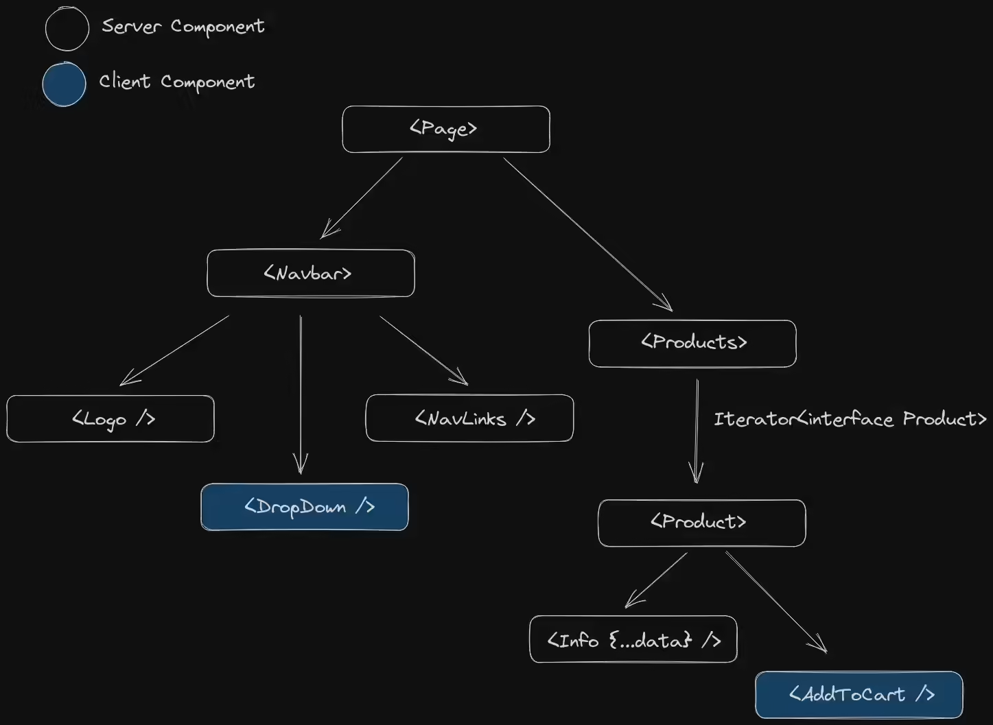
This make sures you ship only the JavaScript for the interactive elements. In this case, the <AddToCard /> and <DropDown /> are the only interactive elements. But they were at the end of the tree for a reason. When you import a Server Component in a Client Component directly, the Server Component now actually works like a Client Component. This means it ships its JavaScript to the browser. Most of the time, it is better to put Client Components at the end/leaf of the component tree. Sometimes, it’s not possible to put a interactive element at the end because it either hurts the User Experience or needs interactivity itself. To Solve this, we can use children or props. This can make the code a little more confusing, so use it only when necessary.
// This is worth 1.7kb of JavaScript.
import { IoMdThumbsUp } from "@react-icons/all-files/io/IoMdThumbsUp";

import getPost from "@/services/posts";

interface Props { ... }

export default async function Page({ params }: Props) {
  const post = await getPost(params.id);

  return (
    <main className="bg-dark-gray">
      {/* Client Component */}
      <LikeButton postId={params.id} likeCount={post.likes}>
        <IoMdThumbsUp />
        <p className="text-primary text-base duration-200 hover:text-primary-dark">Like</p>
      </LikeButton>
    </main>
  );
}
And now, inside the <LikeButton />, we can use the children prop. This makes the button interactive, but keeps its childrens server-side, reducing the Bundle Size by 2kb.
"use client";
import { useState, type PropsWithChildren } from "react";

import { likePost } from "@/actions/posts";

interface Props extends PropsWithChildren { ... }

export default function LikeButton({ children, likeCount, postId }: Props) {
  const [likes, setLikes] = useState(likeCount);

  async function likePost() {
    setLikes(prevLikes => ++prevLikes);

    // Server Action
    likePost(postId);
  }

  return (
    <button onClick={likePost}>
      {children}
      {likes}
    </button>
  );
}
Sometimes, we might want to conditionally render two icons depending on the state of the <LikeButton />, but using children can make the code unreadable. To address this problem, we can use props instead.
import { IoMdThumbsUp } from "@react-icons/all-files/io/IoMdThumbsUp";
import { RiThumbUpLine } from "@react-icons/all-files/ri/RiThumbUpLine";

export default function Page() {
  const isLiked = "...";

  return (
    <main class="bg-dark-gray">
      <LikeButton isLiked={isLiked} likedIcon={<IoMdThumbsUp />} unlikedIcon={<RiThumbsUpLine />} />
    </main>
  );
}
Then in <LikeButton />, we can use the props to change the icon when state changes. This approach gives a responsive & fast UI on the frontend, while keeping icons & business logic on the backend.
"use client";
import { useState } from "react";

interface Props { ... }

export default function LikeButton({ isLiked, likedIcon, unlikedIcon }: Props) {
  const [liked, setLiked] = useState(isLiked);

  function likePost() {
    setLiked(true);

    // ...
  }

  return (
    <button onClick={likePost}>
      {liked ? likedIcon : unlikedIcon}
    </button>
  );
}
Client Chunks, Server Actions and RSCs
Normally when creating a form with the new Next.js 13.4’s Server Actions, we can use a Server Component. This has an advantage of working without JavaScript and also shipping less JavaScript to the client.
export default function Create() {
  function addPost(formData: FormData) {
    "use server";

    // ...
  }

  return (
    <main className="...">
      <h1 className="...">Create Post</h1>
      <form action={addPost}>
        <input type="text" name="title" className="..." />
        <input name="subtitle" className="..." />
        <textarea name="content" className="..." />
        <input type="file" name="image" className="..." />
        <button type="submit" className="...">
          Add Post!
        </button>
      </form>
    </main>
  );
}
The above snippet looks fine. But what if we want the input with name="image" to show a preview in the browser when an image is selected? The obvious approach would be to put "use client" at the top of the file to make it a Client Component and then add an useState() call. The pitfall of this approach would be more client-side JavaScript and inability to put the server action inside the component file. As I said, we should only ship what is interactive, and to fix this, we can instead seperate the image input into a different <PreviewImage /> component.
"use client";
import { useState, lazy } from "react";

const Image = lazy(() => import("next/image"));

export default function PreviewImage() {
  const [previewImage, setPreviewImage] = useState<File | null>(null);

  return (
    <>
      <input onChange={e => setPreviewImage(e.target.files?.[0])} className="..." />
      {previewImage && (
        <Image
          src={URL.createObjectURL(previewImage)}
          // ...
        />
      )}
    </>
  );
}
This approach gives the best of both worlds. An awesome responsive frontend UX with React and a form that does most of the work on the server. Since the <input name="image" /> is prerendered on the server, if JavaScript is disabled, then the form would still work, just the preview image won’t be displayed. You can even do the same with the submit button. Create a seperate <SubmitButton /> component that uses experimental_useFormStatus() to display a loading spinner while the form is performing the action. So when a normal user clicks it, it shows a loading spinner inside the button, but if JavaScript is disabled, the browser itself will reload the page. Either way, it can provide a better UX & working form for both JavaScript enabled/disabled users.
Conclusion
Although the tips I provided above can reduce the client-side JavaScript bundle size, you should use it only when you know it won’t hurt the UX. You should always prioritize UX over performance. If any of my suggestions hurt the UX, then it’s better to avoid them and instead focus on a better experience. JavaScript is not something to avoid all the time when you’re using a JavaScript framework. For more tips on optimizing for the smallest size, you can check out the Next.js documentation.